
Rectangular- and Gaussian Low Pass Filtering
Author: Johannes Maucher
Last Update: 28th January 2021
In section Basic Filter Operations and section Gaussian Filters the average- and the Gaussian filter have been described, respectively. Both of them blur their input by calculating at each position \(i\) a weighted sum of the values \(f(i+u)\) in the neighbouring positions.
The difference is that for the the average filters the weights \(h(u)\) are all the same, whereas in the Gaussian filter the weights \(h(u)\) decrease for increasing absolute values of \(u\).
Both filters reduce variations in neighbouring values by replacing original values by neighbourhood-averages. Filters with this property are called Low-Pass Filters (LP). In order to understand this term, the term of frequency in the context of images must be explained: In image-processing the term of frequency refers to pixel-value variations within a neighbourhood. If their are strong variations within neighbouring pixel-values we speak of high-frequencies, whereas in homogenous regions with nearly no variations the frequency is low. A Low-Pass filter suppresses high-frequencies, whereas low-frequencies are left unchanged. Correspondingly, a High-Pass Filter (HP) suppresses low-frequencies but leaves high-frequencies unchanged. Both, Low- and High-Pass Filters have a wide range of applications in image-processing, for example noise-reduction (LP) and contour-extraction (HP). Noise reduction is subject of the next section.
In the current section we will demonstrate and compare the properties of the average- and Gauss-Filter. For this demonstration we apply 1-dimensional signals and filters. The adaptation to the 2-dimensional case should be obvious.
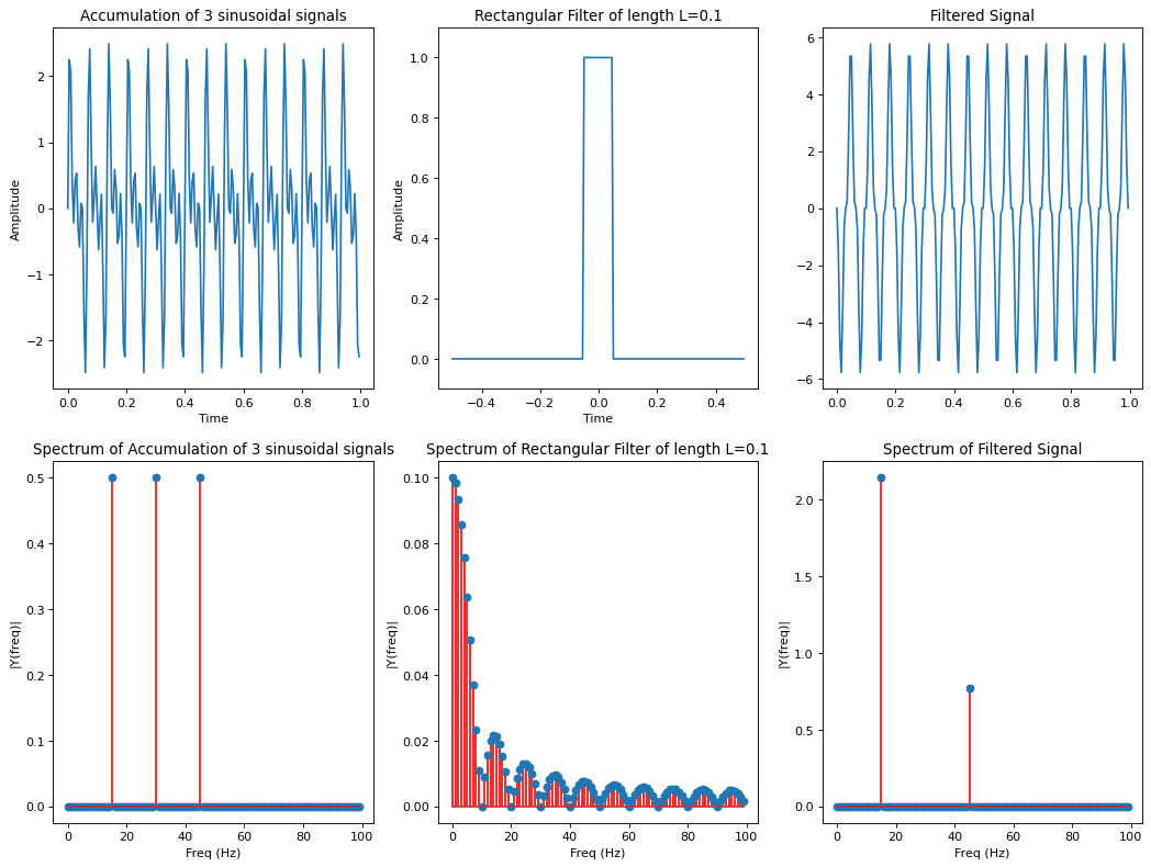
We will apply both filters to a signal, which is the sum of three sinusoidal signals of different frequencies
Again, the scipy ndimage package is applied for convolution filtering.
#!pip install --upgrade scipy
from matplotlib import pyplot as plt
import numpy as np
import scipy.ndimage as ndi
import scipy.fft as sf
import warnings
warnings.filterwarnings("ignore")
Function for calculating and plotting the spectral representation of a signal
The function below calculates the single-sided amplitude spectrum of a 1-dimensional time domain signal \(y\). The sampling frequency \(Fs\) is required for a correct scaling of the frequency-axis in the plot.
def plotSpectrum(y,Fs,title="",FX=None,FY=None):
 """
 Plots a Single-Sided Amplitude Spectrum of y(t)
 """
 n = len(y) # length of the signal
 k = np.arange(n)
 T = n/Fs
 frq = k/T # two sides frequency range
 frq = frq[range(int(n/2))] # one side frequency range

 Y = sf.fft(y)/n # fft computing and normalization
 Y = Y[range(int(n/2))]
 if (FX and FY)!=None:
     plt.figure(figsize=(FX,FY))
 plt.stem(frq,abs(Y),'r') # plotting the spectrum
 plt.title(title)
 plt.xlabel('Freq (Hz)')
 plt.ylabel('|Y(freq)|')
Define signal that shall be filtered
The input signal
is generated and visualized in the following code-cells:
Fs = 200.0;  # sampling rate
Ts = 1.0/Fs; # sampling interval
t = np.arange(0,1,Ts) # time vector for signal
ff = 15;   # lowest frequency in the signal
y = np.sin(2*np.pi*(ff)*t)+np.sin(2*np.pi*(2*ff)*t)+np.sin(2*np.pi*(3*ff)*t)
sigTitle="Accumulation of 3 sinusoidal signals"
FIGX=8
FIGY=6
plt.figure(figsize=(FIGX,FIGY))
plt.plot(t,y)
plt.xlabel('Time')
plt.ylabel('Amplitude')
plt.title(sigTitle)
Text(0.5, 1.0, 'Accumulation of 3 sinusoidal signals')
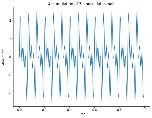
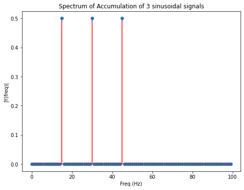
The spectrum of this signal is plotted below. As can be seen, it contains non-zero values only at the frequencies \(f=15 Hz\), \(f=30 Hz\) and \(f=45 Hz\):
plotSpectrum(y,Fs,title="Spectrum of "+sigTitle,FX=FIGX,FY=FIGY)
Rectangular (Average) Low Pass Filtering
Below an average filter of with \(L=0.1s\) is defined:
L1=0.1 #filter length
tf=np.arange(-0.5,0.5,Ts) # time vector for filter
filt1=np.zeros(len(tf))
filt1[int((0.5-L1/2)*len(tf)):int((0.5+L1/2)*len(tf))]=1.0
filt1Title="Rectangular Filter of length L=" + str(L1)
We also define an average filter of length \(L=0.2s\):
L2=0.2 #filter length
filt2=np.zeros(len(tf))
filt2[int((0.5-L2/2)*len(tf)):int((0.5+L2/2)*len(tf))]=1.0
filt2Title="Rectangular Filter of length L=" + str(L2)
Next both average filters are plotted in time domain (first row) and frequency domain (second row). As can be seen: The higher the width of the filter in time domain, the smaller the bandwith of the filter in frequency domain (i.e. the range of low-frequencies which are able to pass the filter).
plt.figure(figsize=(14,10))
#plt.figure(figsize=(FIGX,FIGY))
plt.subplot(2,2,1)
plt.plot(tf,filt1)
plt.grid(True)
plt.title(filt1Title)
plt.xlabel('Time')
plt.ylabel('Amplitude')
ymargin=0.05
ymin,ymax=plt.ylim()
plt.ylim(ymin-ymargin,ymax+ymargin)

plt.subplot(2,2,2)
plt.plot(tf,filt2)
plt.grid(True)
plt.title(filt2Title)
plt.xlabel('Time')
plt.ylabel('Amplitude')
ymargin=0.05
ymin,ymax=plt.ylim()
plt.ylim(ymin-ymargin,ymax+ymargin)

plt.subplot(2,2,3)
plotSpectrum(filt1,Fs,title="Spectrum of "+filt1Title)

plt.subplot(2,2,4)
plotSpectrum(filt2,Fs,title="Spectrum of "+filt2Title)
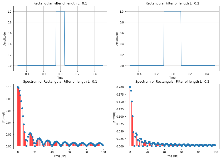
As can be seen in the plot above, the spectrum of the filter is not monotonously decreasing with increasing frequency. For the filter of width \(L=0.1s\), a frequency of \(f=0\) is not suppressed. In the range from 0 to 10 Hz, the suppression increases and a frequency of \(f=10Hz\) is totally blocked. However, from 10 to 15 Hz the suppression decreases and \(f=20 Hz, f=30 Hz, ...\) are again totally blocked.
Apply rectangular filter to input signal
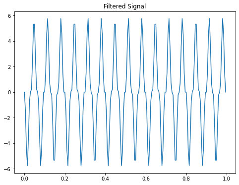
Next we convolve the average-filter of length \(L=0.1s\) with the input signal:
fo1=ndi.convolve1d(y,filt1, output=np.float64,mode="wrap")
The filtered signal and it’s spectrum is visualized below:
plt.figure(figsize=(FIGX,FIGY))
plt.plot(t,fo1)
plt.title("Filtered Signal")
Text(0.5, 1.0, 'Filtered Signal')
plotSpectrum(fo1,Fs,title="Spectrum of Filtered Signal",FX=FIGX,FY=FIGY)
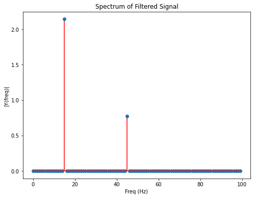
As can be seen in the plots above, the average filter blocked the frequency of \(f=30 Hz\) totally. The signal part with \(f=15 Hz\) is suppressed less than the signal part with \(f=45 Hz\).
Plot signal, filter and filtered signal in time- and frequency domain
Below we just summarize the visualisations of the input-signal, filter and output-signal, both in time- and frequency-domain:
plt.figure(num=None, figsize=(16,12), dpi=80, facecolor='w', edgecolor='k')
plt.subplot(2,3,1)
plt.plot(t,y)
plt.xlabel('Time')
plt.ylabel('Amplitude')
plt.title(sigTitle)
plt.subplot(2,3,2)
plt.plot(tf,filt1)
plt.title(filt1Title)
plt.xlabel('Time')
plt.ylabel('Amplitude')
ymargin=0.05
ymin,ymax=plt.ylim()
plt.ylim(ymin-ymargin,ymax+ymargin)

plt.subplot(2,3,4)
plotSpectrum(y,Fs,title="Spectrum of "+sigTitle)
plt.subplot(2,3,5)
plotSpectrum(filt1,Fs,title="Spectrum of "+filt1Title)
plt.subplot(2,3,6)
fo1=ndi.convolve1d(y,filt1, output=np.float64,mode="wrap")
plotSpectrum(fo1,Fs,title="Spectrum of Filtered Signal")
plt.subplot(2,3,3)
plt.plot(t,fo1)
plt.title("Filtered Signal")
Text(0.5, 1.0, 'Filtered Signal')
Gaussian Filter
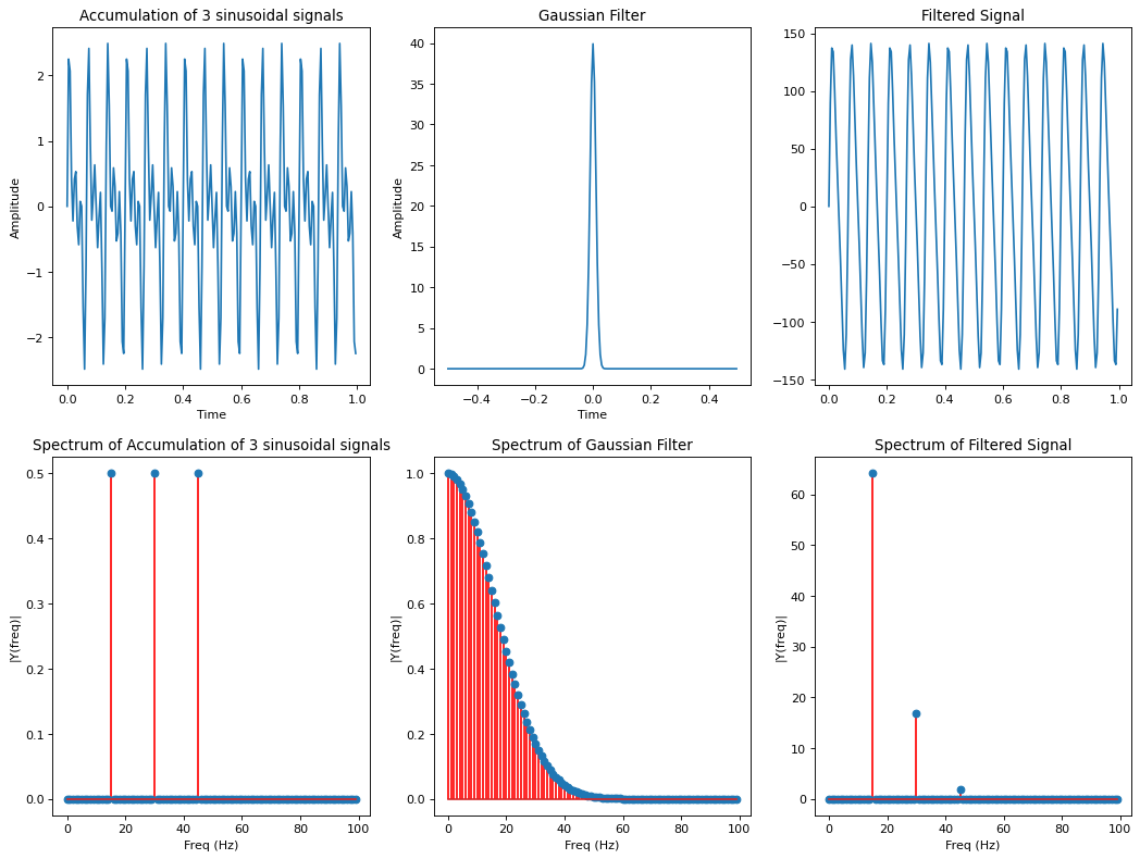
The same process as above is now repeated for the Gaussian Filter. In contrast to the average-filter, the spectrum of the Gaussian filter decreases monotonously with increasing frequency. This is actually what we expect from a Low-Pass: The signal suppression increases with increasing frequency.
sig=0.01
m=0.0
filt=np.exp(-((tf-m)/sig)**2/2)/(sig*np.sqrt(2*np.pi))
filtTitle="Gaussian Filter"
Plot signal, filter and filtered signal in time- and frequency domain
plt.figure(num=None, figsize=(16,12), dpi=80, facecolor='w', edgecolor='k')
plt.subplot(2,3,1)
plt.plot(t,y)
plt.xlabel('Time')
plt.ylabel('Amplitude')
plt.title(sigTitle)
plt.subplot(2,3,2)
plt.plot(tf,filt)
plt.title(filtTitle)
plt.xlabel('Time')
plt.ylabel('Amplitude')
ymargin=0.05
ymin,ymax=plt.ylim()
plt.ylim(ymin-ymargin,ymax+ymargin)

plt.subplot(2,3,4)
plotSpectrum(y,Fs,title="Spectrum of "+sigTitle)
plt.subplot(2,3,5)
plotSpectrum(filt,Fs,title="Spectrum of "+filtTitle)
plt.subplot(2,3,6)
fo1=ndi.convolve1d(y,filt, output=np.float64,mode="wrap")
plotSpectrum(fo1,Fs,title="Spectrum of Filtered Signal")
plt.subplot(2,3,3)
plt.plot(t,fo1)
plt.title("Filtered Signal")
Text(0.5, 1.0, 'Filtered Signal')
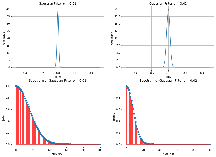
In the case of the average-filter, it has been shown above, that by increasing the filter-length \(L\) in time-domain, the bandwidth of the filter can be decreased and vice versa. In the case of the Gaussian filter the bandwidth can be controlled by the standard-devaiation \(\sigma\). Increasing \(\sigma\) yields an increased width of the filter in time-domain, but a decreased bandwidth in frequency domain. This is demonstrated below, by visualizing a Gaussian filter with \(\sigma=0.01\) and one with \(\sigma=0.02\):
sig1=0.01
m=0.0
filt1=np.exp(-((tf-m)/sig1)**2/2)/(sig1*np.sqrt(2*np.pi))
filt1Title="Gaussian Filter $\sigma$ = "+str(sig1)

sig2=0.02
m=0.0
filt2=np.exp(-((tf-m)/sig2)**2/2)/(sig2*np.sqrt(2*np.pi))
filt2Title="Gaussian Filter $\sigma$ = "+str(sig2)
plt.figure(figsize=(14,10))
#plt.figure(figsize=(FIGX,FIGY))
plt.subplot(2,2,1)
plt.plot(tf,filt1)
plt.grid(True)
plt.title(filt1Title)
plt.xlabel('Time')
plt.ylabel('Amplitude')
ymargin=0.05
ymin,ymax=plt.ylim()
plt.ylim(ymin-ymargin,ymax+ymargin)

plt.subplot(2,2,2)
plt.plot(tf,filt2)
plt.grid(True)
plt.title(filt2Title)
plt.xlabel('Time')
plt.ylabel('Amplitude')
ymargin=0.05
ymin,ymax=plt.ylim()
plt.ylim(ymin-ymargin,ymax+ymargin)

plt.subplot(2,2,3)
plotSpectrum(filt1,Fs,title="Spectrum of "+filt1Title)

plt.subplot(2,2,4)
plotSpectrum(filt2,Fs,title="Spectrum of "+filt2Title)
Spectrum of 2-dimensional Average- and Gaussian Filter
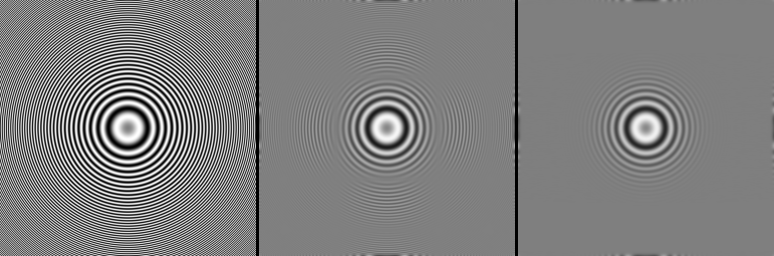
The different behaviour of average- and Gaussian-filter, as demonstrated above for 1-dimensional signals, is the same for 2-dimensional data like images. This is shown in the figure below. The leftmost input-image contains low frequencies at the center, with increasing radial distance from the center, the frequency increases. The center image shows the result from filtering the input image with an 2-dimensional average-filter. As can be seen the suppression does not monotonously increase with increasing frequency: some lower frequencies are suppressed stronger than higher frequencies. In the image on the right hand side, the output of a Gaussian filter is shown. Here the suppression increases with increasing frequency.
In the next subsection it is shown how low-pass filters can be applied for noise reduction in images.